Moment.dev
Founding Designer / Head of Design (2021 – present)
I am the founding designer and first hire at Moment.dev, a company founded by Microsoft and Lyft alums. I joined to bring design and startup experience to the team. Our mission is to make user-friendly software for infrastructure engineers that allows them to combine all their critical tasks and documentation in one place.
My Role
As the Head of Design for an early-stage company, I am intimately involved in every aspect of the development of the product. My primary focus is designing the flows, UI, design system, and branding using both Figma and code (with CSS, Typescript, and React). Additionally, I collaborate closely with the founders and engineering team on the overall UX, product vision, strategy, and frontend development.
Another major part of my role is leveraging my 15+ years of experience in startups to help the team navigate the early-stage product development cycle. This is a handful of the skills I regularly practice in this role:
Designing all user flows, app UI, and design system.
Collaborating with founders to set overall product vision.
Conducting user interviews to understand user needs, goals, and product usability.
Rapid prototyping in Figma to quickly get feedback from users and technical experts.
Led a rebrand and logo design, and helping craft the brand voice.
Regularly shipping code to production using CSS, React, Typescript, and Tailwind.
The Challenge
As the founding designer creating something from 0 to 1, I had to balance improving product quality with the need to ship quickly, all while setting my own benchmarks. The product is very complex technically, which means limited developer resources for interaction and visual design polish.
Designing for infrastructure engineers was also a new challenge when I first began. These users are accustomed to having full control over their tools, and are most comfortable with command line interfaces. Because of the highly technical nature of their work, I trained engineering colleagues in user research to ride along with me. This added domain expertise helped us get rich data from our research.
My Approach
I follow a loose human-centered design process, maintaining and deepening my partnership with engineering throughout my work. This partnership is critical to our success in finding customer pain points, defining possible solutions, prototype and feature validation, and usability testing.
Working on a small team means ruthless prioritization. I frequently jump into the frontend codebase to alleviate the engineering team's workload and increase design polish. This allows me to push the UI quality forward without slowing down our shipping velocity.
Key Product Themes
It can be a challenge to condense years worth of work into a single case study. Since Moment is a pre-product market fit company, very few projects follow a predetermined path with clear start and end points. These are a few major product themes I infuse into the product throughout the many projects I work on.
Enable Exploration
Infrastructure engineering is a complex and ever-evolving field, so we knew our product had to provide tools for users to explore hard problems with interesting and creative tooling.

User Needs
Users needed a way to take existing todo lists, and begin to automate away many of the mundane parts. However, traditional linear automation doesn't work in many cases because the possible solution paths are too complex. Users often resort to having documentation in one system, scripts in another, and dashboards in yet another. This results in these things falling out of sync, lost documentation, and huge cross-functional collaboration challenges.
Solution
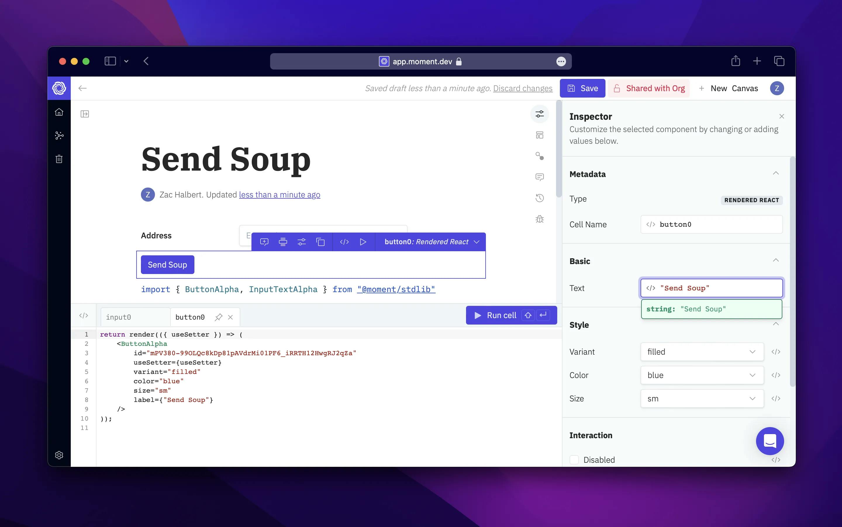
We solved this by building a notebook style interface that allows users to write rich text and drop in pre-made components so they can centralize documentation, data from internal systems, and rich interactive experiences all in one place.
This sandbox environment enables users to explore problems and pull in the relevant data or actions from vendors and critical internal systems.
Result
This interface paradigm gives users the ability to create solutions to hard problems in hours or days which would normally have taken months. When working with customers, it is common to measure efficiency increases in orders of magnitude.
Everything is Hackable
Our customers are accustomed to having full control over everything they do, and each company has incredibly unique requirements.

User Needs
Software for infrastructure engineers is typically too one-size-fits-all. No two companies have identical tools or solutions to common problems.
Solution
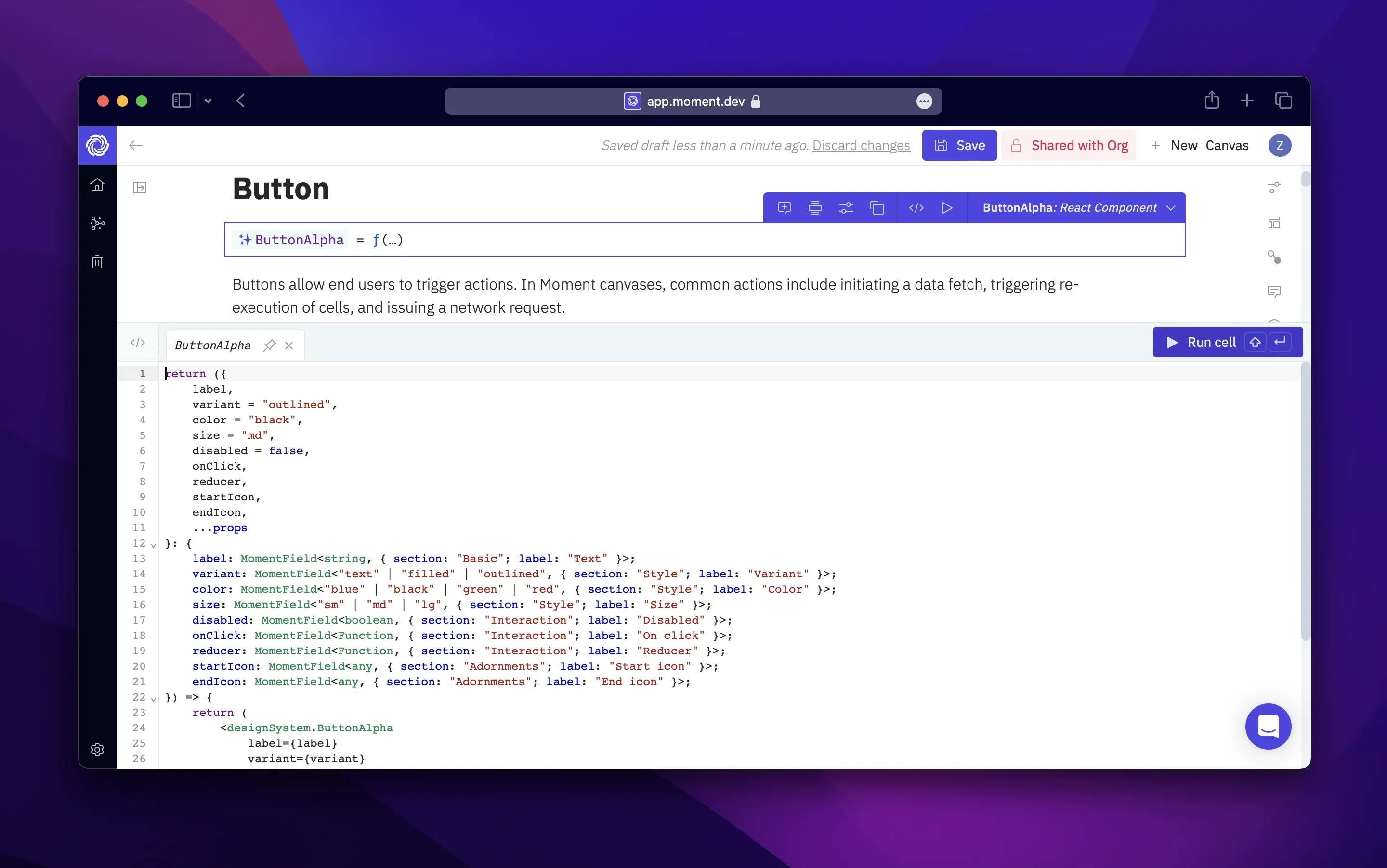
Our answer was to bake hackability into every aspect of the product where customization is important, and obfuscate parts where customization is not necessary. We provide a robust library of premade components and allowed users to see and edit every line of code which was used to create those components. This level of control is very important for our users, who need to customize everything to work with their unique toolchains.
Result
The net result was that users felt significantly more confidence in the product knowing that they could truly customize it to their needs without having to take on the burden of building yet another system from scratch.
Secure by Default
A major challenge when designing this product was the typical security posture of our customers, which is bested described as paranoid — but for good reasons.

User Needs
A major problem we ran into was that users felt uncomfortable providing a third-party vendor access to their most critical infrastructure, which could create the opportunity for security vulnerabilities.
Solution
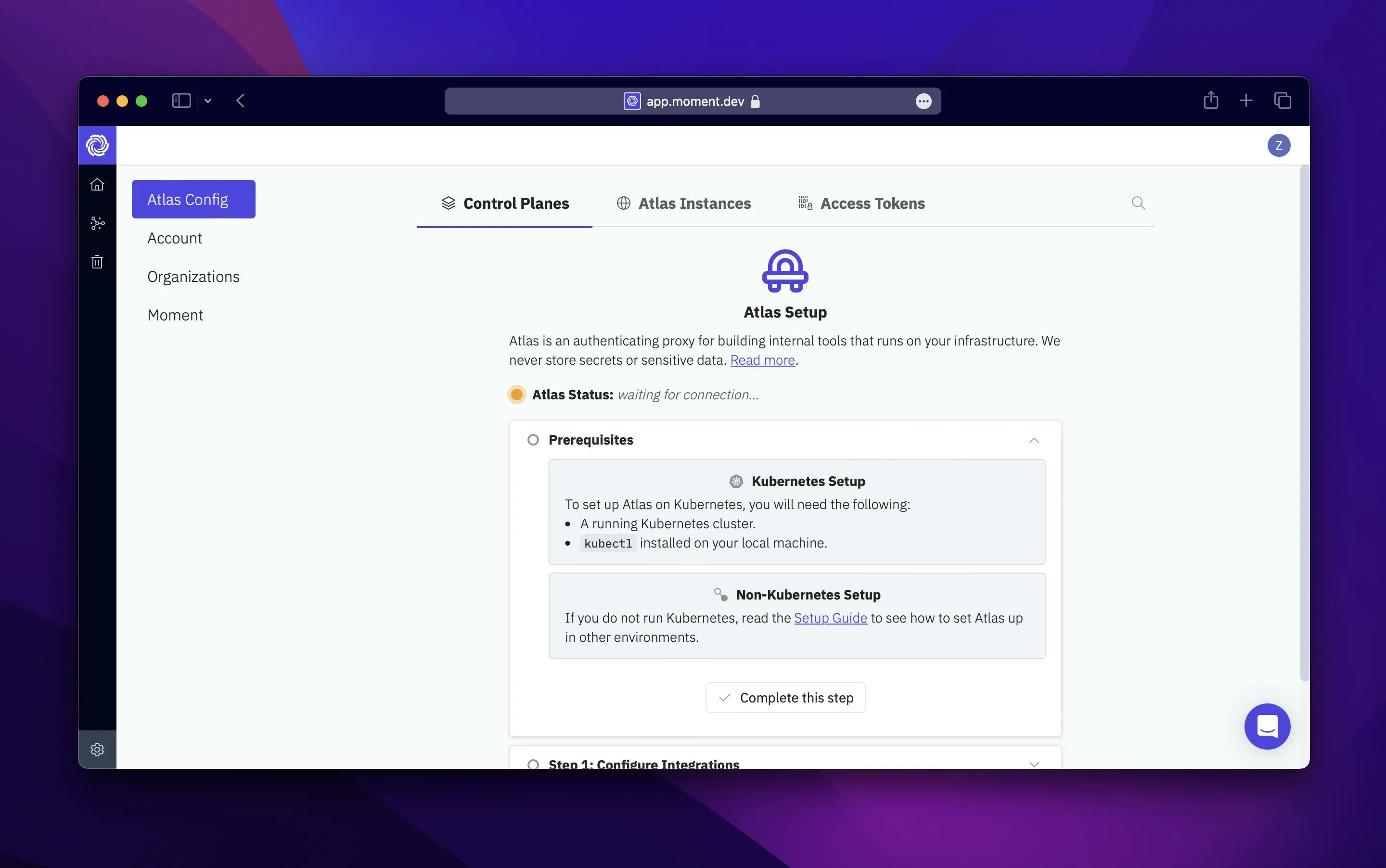
We solved this with a technical solution: an authenticating proxy that runs in the customer's infrastructure which provides Moment secure access to internal data and tools. While this is an engineering solution, it created a huge number of UX challenges such as teaching users how to set up the system and guiding them to convert their Moment Canvases to point at secure data sources.
Result
In the end, this solution alleviated many of the security concerns for our users. It also allows us to deliver on our vision of offering a tool that allows users to centralize their documentation, data, and expertise in one place.
Reflections
One major area for growth was that I needed to fine-tune my product intuition to better meet the needs of infrastructure engineers. There are a variety of UX and UI best practices for consumer software that don't apply. For example, developers value information density and UI contrast significantly more than typical users of consumer software, and are comfortable with UI that an average consumer might call "cramped."
Through this role, I gained deeper insights into the mindset of infrastructure engineers, their goals, and the toil that often floods their day. Infrastructure engineers are very highly leveraged, and work on incredibly complex systems where the stakes are extremely high. They are also not well-served by existing SaaS solutions, so it has been really rewarding to build tools for them.